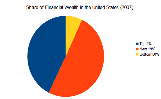
Unbelievable. It looks like the top 20% own more than 90% of the country's wealth, with the top 1% owning more than 40% all by themselves! And that was in 2007. It must be significantly more skewed by now.
Then there is this, which has been making the rounds. According to these figures, the top 20% own more than 80% Of the wealth. It doesn't show what the top 1% own. It shows (a) the actual distribution of wealth (b) what we, on average think it is, and (c) what we, on average, think would be ideal. How naive we are!


1 comment:
The pic does not show
Post a Comment