Look at this graph—my first attempt to use FRED. It shows that employment is below its level at the start of this century whereas corporate profits and GDP are way above. The green line in the middle represents the total US population. The orange is corporate profits. All lines are scaled to an index that starts at 100 on Jan 1, 2000.

This next graph substitutes the S&P500 for the population. (Apparently FRED is limited to 4 lines at a time.)
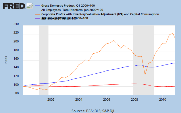 I'm surprised to see how corporate quarterly profits lead the stock market. I thought it was supposed to be the other way around!

No comments:
Post a Comment